Goals
The current site looked outdated and did not represent, visually, their tagline: "Vacations for the Soul". The textured background, featuring the Vitruvian Man, the confusing navigation and the small typeface easily dated the site.
Such an original and classy company needed more than tired cliches. Even if the business was not suffering, they believed a fresh website would help drum up more business.
Solution
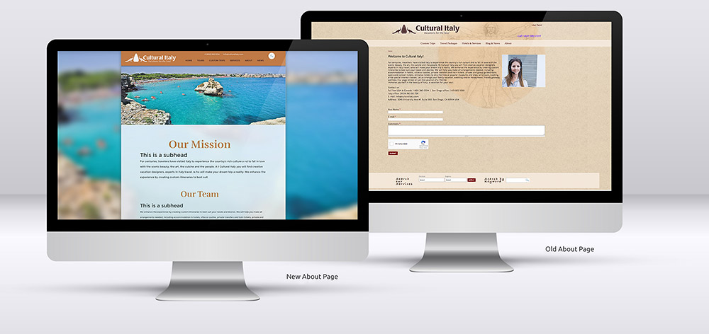
My solution was to move a lot of the original home page content to different areas, and to add more focus on their packages and services. The testimonials were given more emphasis and the lighter color scheme made the site look modern and elegant, and more upscale.
The navigation was also organized in a more logical way, and the site content was given prominence using generous negative space. The forms, one of the most frustrating part of the old site, were given a new look to look less intimidating.
Steps
Analyze
Empathize
Ideate
Design
Visuals
Hand Off
Analyze
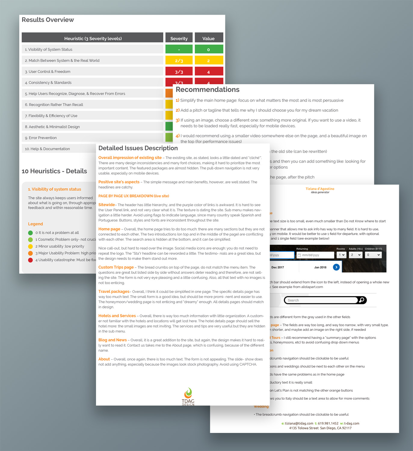
UX Audit • Cognitive Walk throughThe first step was to do a brutal UX Audit of the old site. I researched and tested various competitors and then I provided a complete evaluation based on tasks execution, and comparing the site to well accepted principles of usability.
Both positive and negative aspects were noted in details, together with general advice. Based on this research, I provided a detailed written report, including hits and misses, and complete recommendations on how to improve the web presence.
Empathize
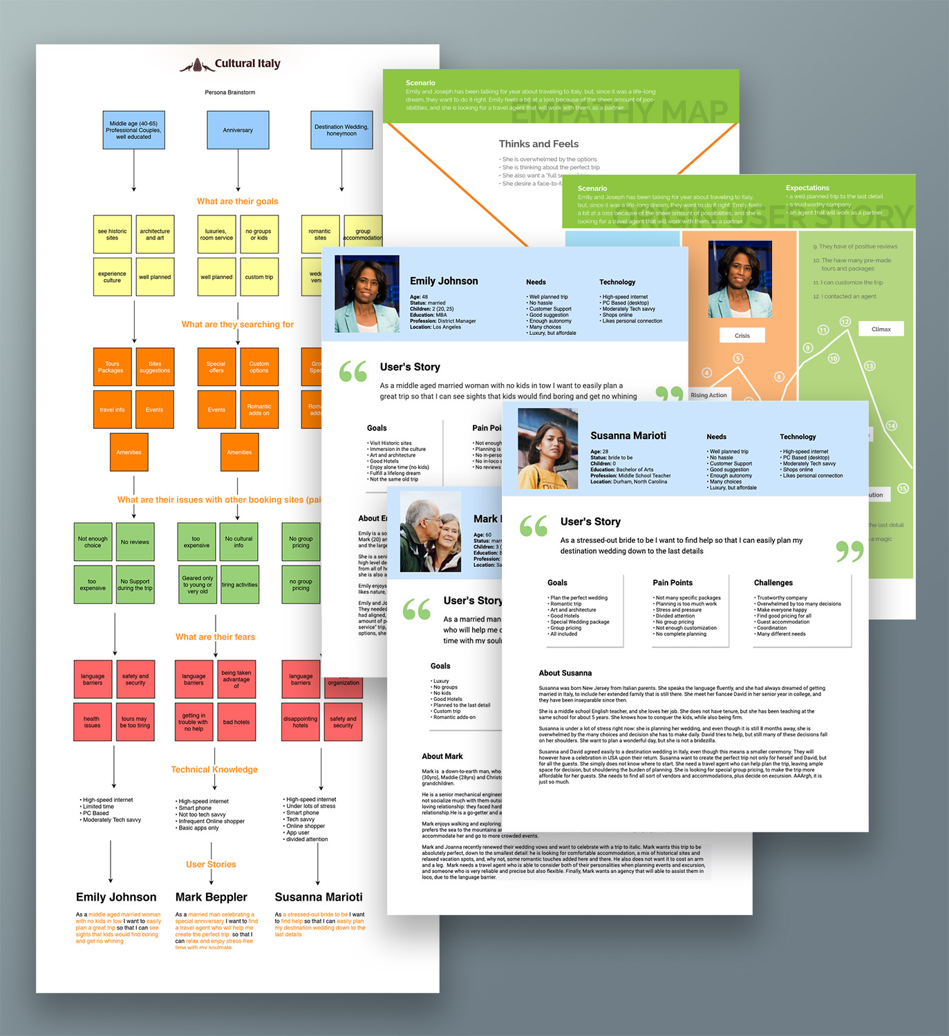
Personas • Emotional Map • Customer Story
I was provided general psychographic and demographic data about the target users. The budget did not allow for more in depth research, so I used extensively the existing data.
Based on the information provided, I identified 3 different categories of users, with different goals and needs, and generated a comprehensive persona for each, along with an emotional map for their most critical goal.
This allowed me to emphatize with the customers’ main pain points and frustrations, as well as their goals.
Ideate
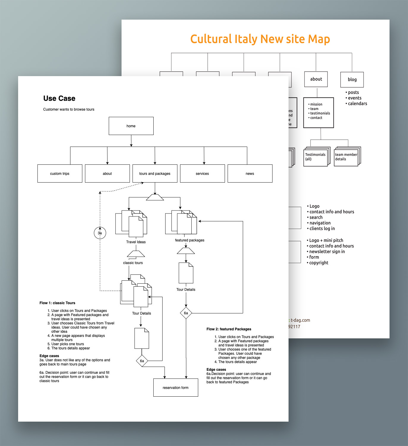
Critical Tasks • Screenflows • Sitemap
With the main user groups clearly identified, it was time to ideate solutions.
We mapped user goals and frustrations and were able to identify the most critical tasks the site needed to highlight and simplify.
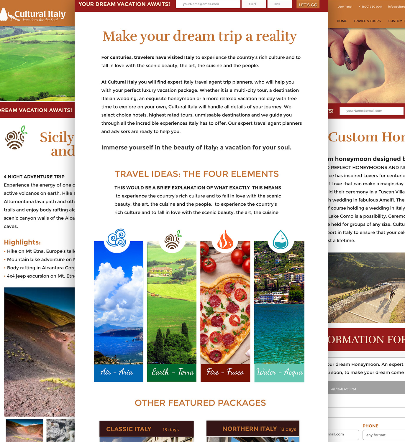
A new architecture, and a more logical organization was developed: The main goal was to simplify and eliminate clutter, and to have a clear visual hierarchy. Content was reorganized and moved when appropriate.
I developed screen flows and a site map and presented to the client. After a few productive discussions, we landed on a site structure that allowed the target customers to achieve their goals.
Design
Wireframes • Lo-fi Prototype
Once the new flow of the site was approved, I created wireframes, to visually demonstrate the new flow and finalize design choices.
I also presented wire flow (or screen sequences) for the most critical tasks. The developer was consulted and gave us feedback on the intectivity. After a general approval from the client, I generated ian nteractive wireframe for the final green light.
Interact with the wireframe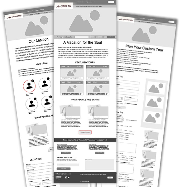
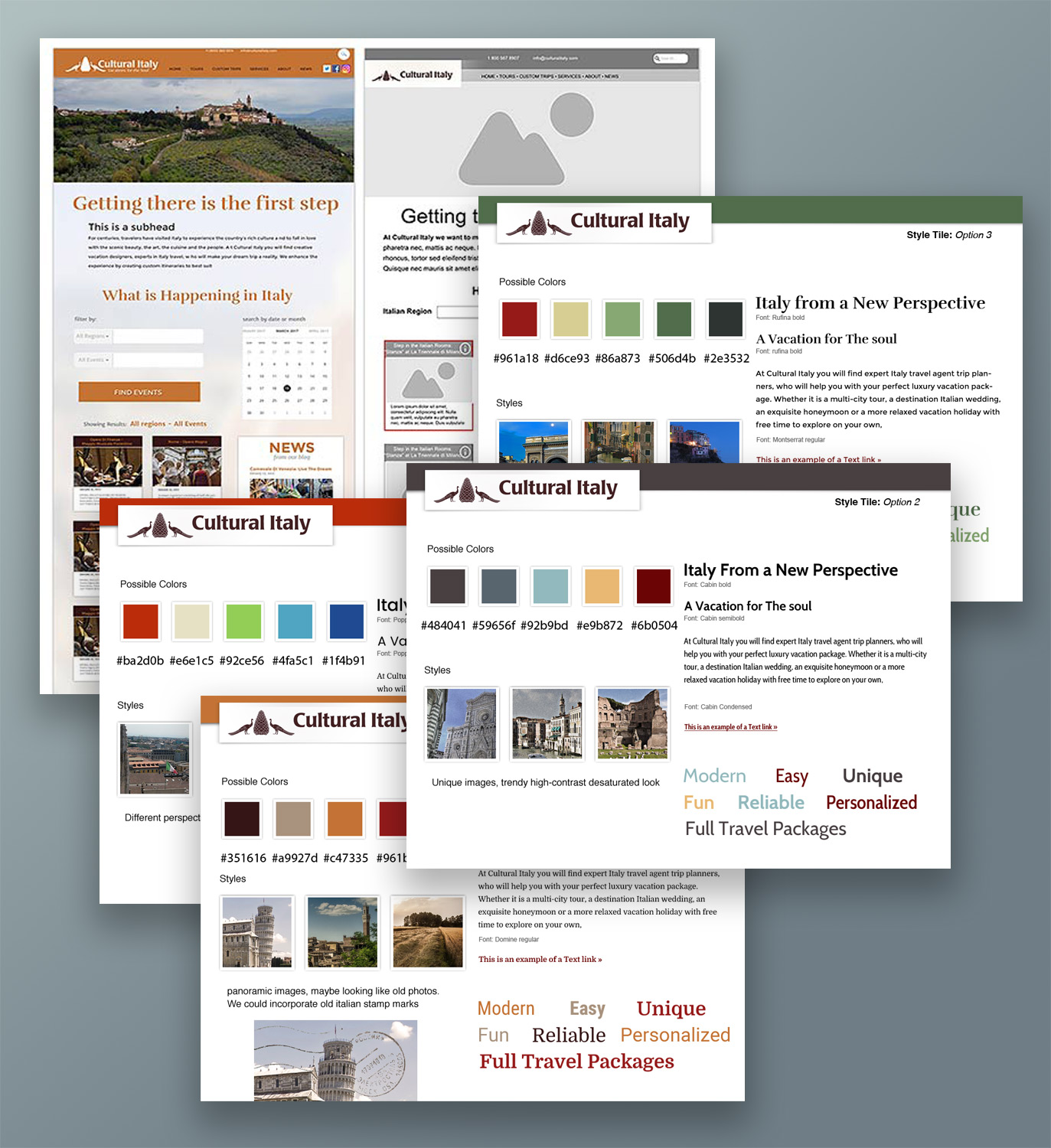
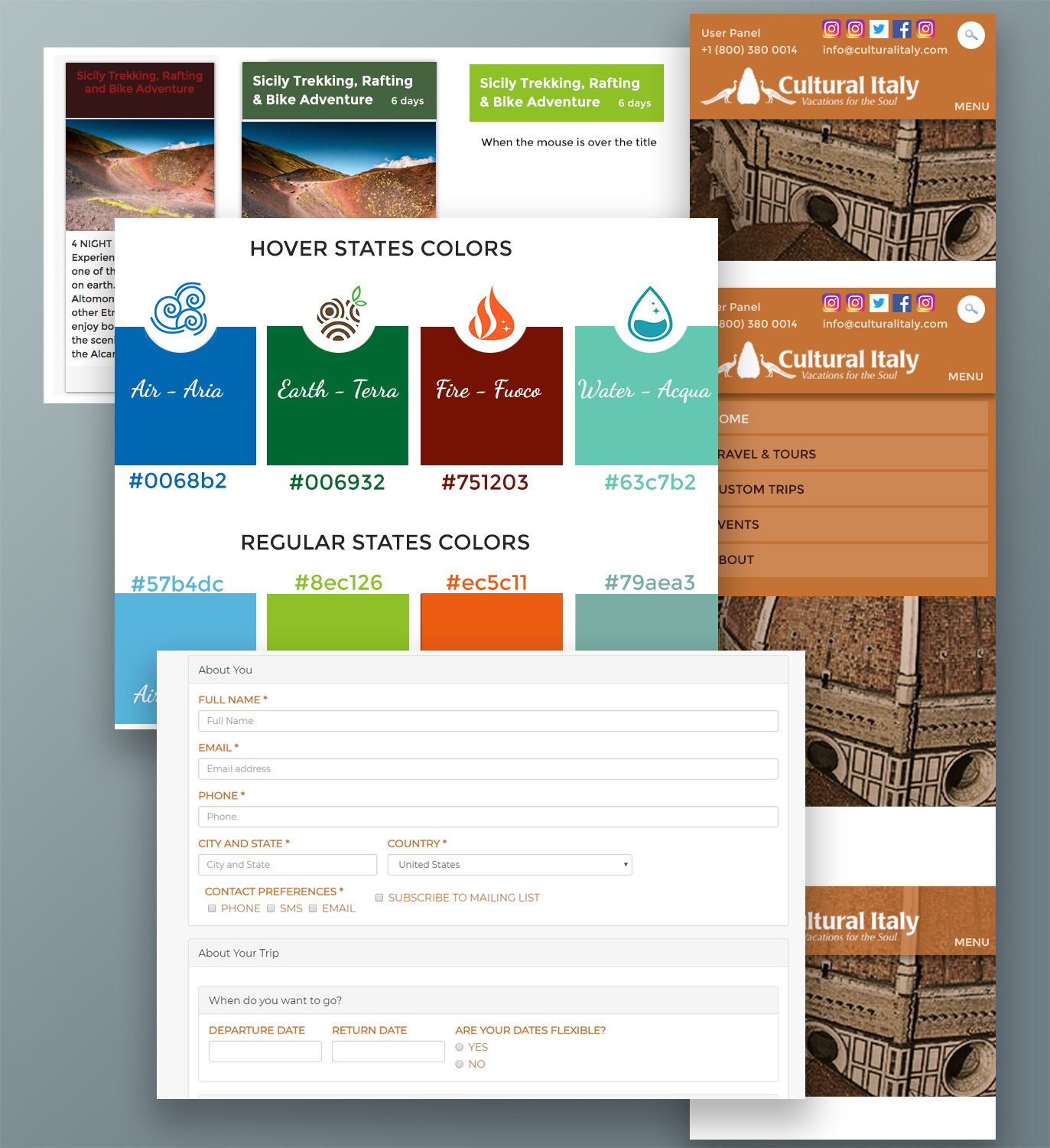
Visual Design
Style Tiles • Comps • Clickable Prototype
With the basic framework of the site in place, I moved on color palettes and mood boards, to define the specific styles, typefaces and colors for the new site. The colors were chosen to break the mold from "traditional" colors and typefaces associated to anything Italian, and to convey sophistication, elegance and luxury.
I offered the client 4 different options, and after a brainstorming session, we chose the final visual elements.
It was time to finally translate our content to interface design. Using the approved wireframes and screen flows as template, I applied the visual styles to a clickable prototype for the client. The main pages and interactions were designed fully to help the developer build our vision. A desktop and mobile versions were presented to demonstrate how the site would look on different devices.
Hands Off
Style Guides
After a few minor corrections, the design was finished and ready to be passed on to the developer for final coding. I created a small style guide for the developer, to make sure that the look and feel was consistent, now and in the future. visit site
Results and Next Steps
The new website has been very successful in bringing new clients and especially in reducing the number of bounce-backs (people who quickly leave the site). It now really represents the high-end, luxury experience that Cultural Italy Provides.
However, there are still plenty improvements that can be made: the navigation has not been simplified as recommended, and it still creates some confusion in the customers. The next steps will be to plan more User Testing to improve the usability. Unfortunately, COVID-19 stopped the process after only 4 tests, but even so, we already have some implementable feedbacks
Conclusion
This project is one of my favorites, because I was responsible for most of the UX Design and Interaction Design process, along with the Visual Design.
The biggest obstacle was the limited budget that did not allowed us to conduct more Users Research and Testing.
One other thing that proved a bit harder than expected was how to communicate my design ideas thoroughly to the developer, assuming he would see what I saw. I should have created a style guide earlier in the process: lesson learned.
Contact me
Chiama
Do you want to know more? Are you intrigued? Contact me: I love to meet new people. If you need a new site, or a consultation, maybe some private lessons, or an incredible hand-made cappuccino, I am here to help.
Let's get a coffee
If you are in the San Diego area, stop by and say CIAO! We can talk about your new project with nice cup of java, or in front of an ice cream, whatever you prefer.